Horror Font Pairings
A horror display font does one job: grab attention. It's terrible at the second job, which is telling people where and when. That's what the body font is for. Get the pairing right and the design looks planned. Get it wrong and the flyer looks like a ransom note.
Four rules for pairing a horror font
- Contrast, not competition. The display font is messy and loud, so the body font should be calm and plain. A clean sans-serif is almost always the answer. Two textured fonts side by side cancel each other out.
- Keep a size ratio of about 3:1. If the headline is 120 pt, the details sit around 40 pt or smaller. When the two are close in size, nothing looks like the headline.
- One display font per design. Pick a single horror style and commit. If you want variety, change the color or size of the body text instead of adding a second scary font.
- Line things up. Rough letters look chaotic on purpose. Give them a firm frame: center everything, or left-align everything. Mixed alignment plus messy letters reads as a mistake.
Pairings for each Bloodmoon font
All of these body fonts are free and either come with your computer or are easy to find in Canva and other design apps.
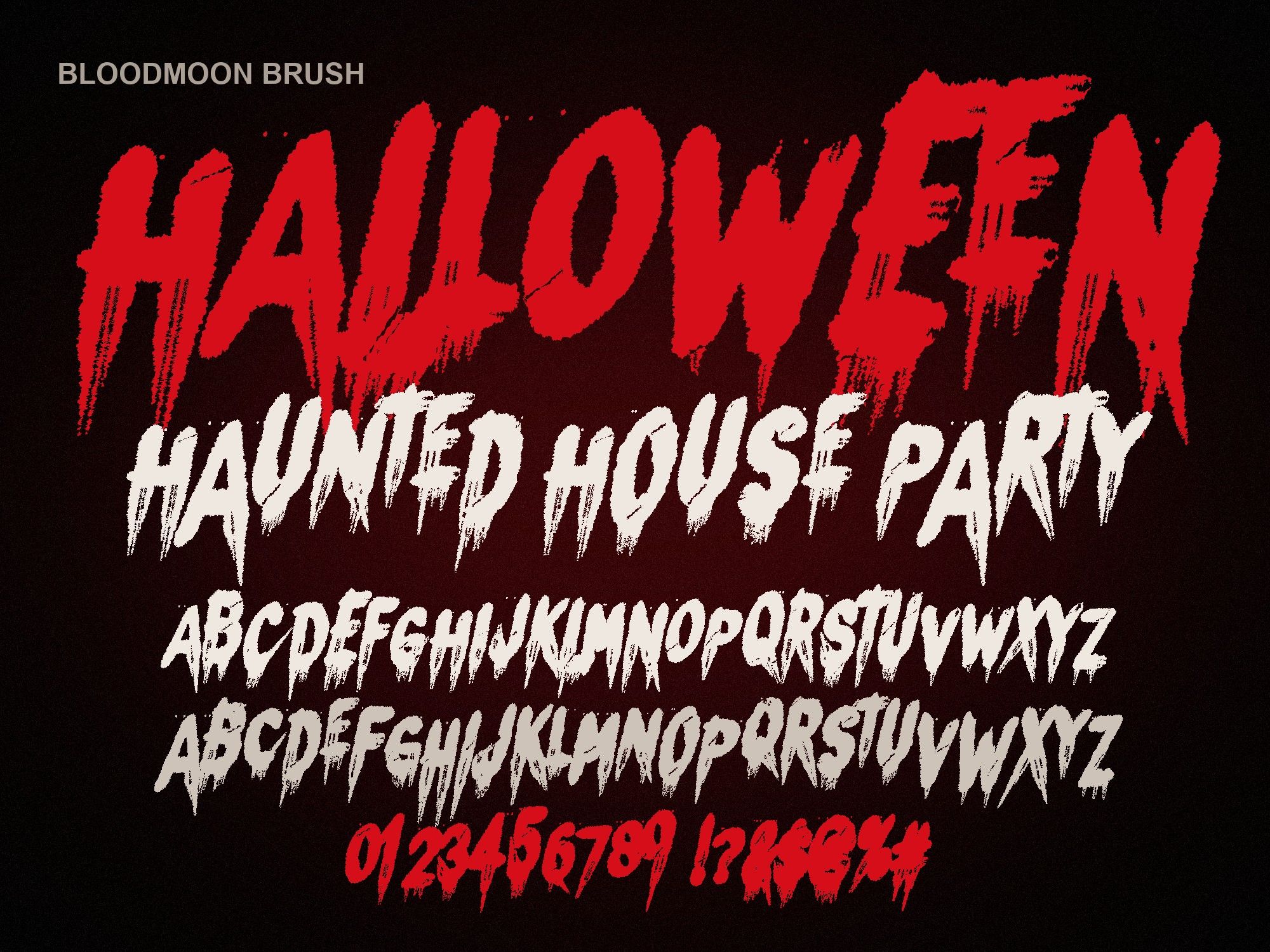
Dripping blood font (Bloodmoon Brush)
Pair with: Oswald or Bebas Neue.
Brush is wide and wet. A tall, narrow, all-caps body font gives it a straight edge to lean against. Set the details in Oswald for something readable at small sizes, or Bebas Neue if the secondary line is short, like a date.
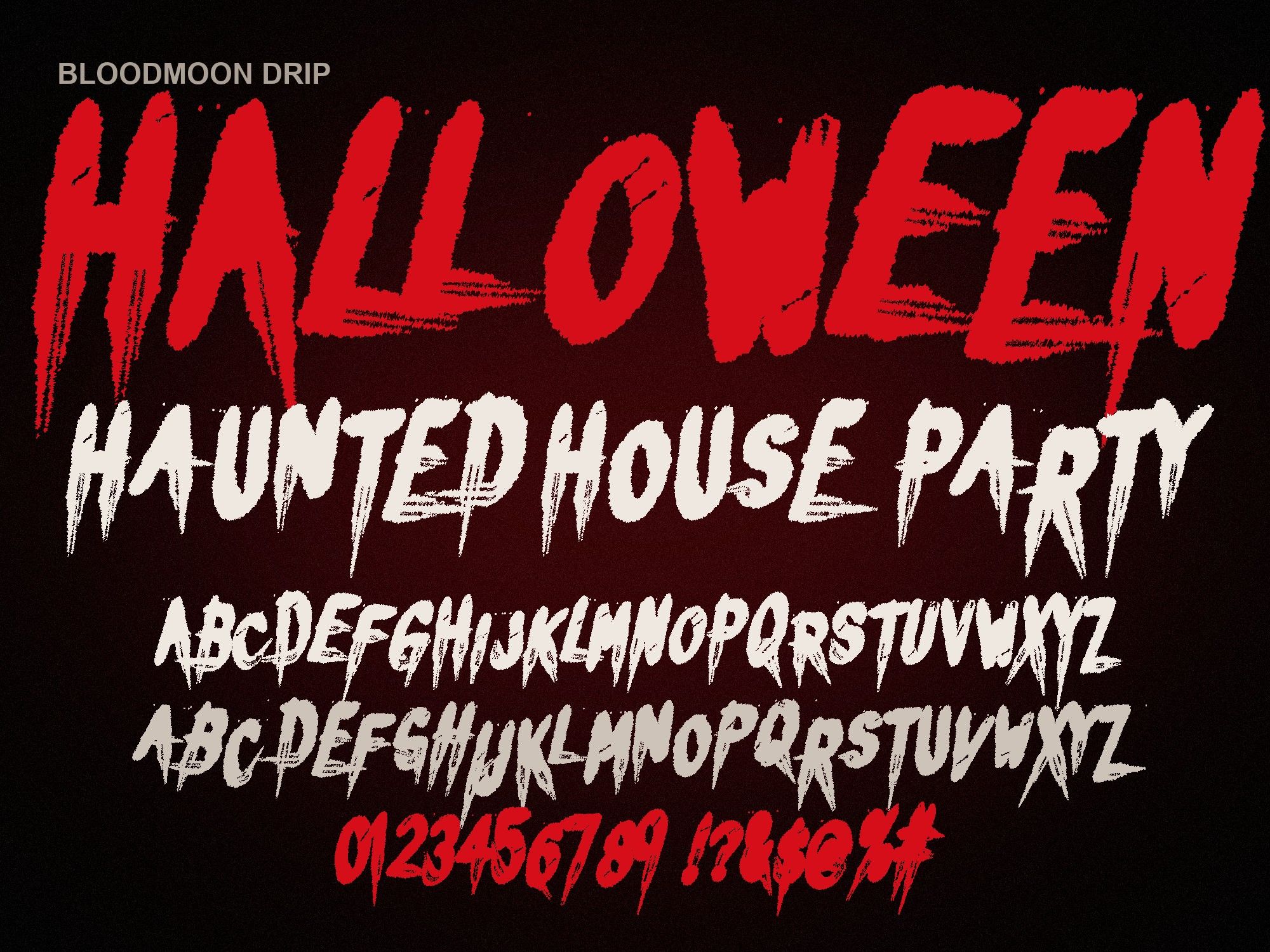
Bloody dripping letters font (Bloodmoon Drip)
Pair with: Montserrat or Work Sans.
Drip bounces around and has long tails. A round, friendly sans keeps the playful mood and gives the eye a rest. Montserrat in a bold weight suits kids' party invites. Work Sans is lighter and works for longer lines of text.
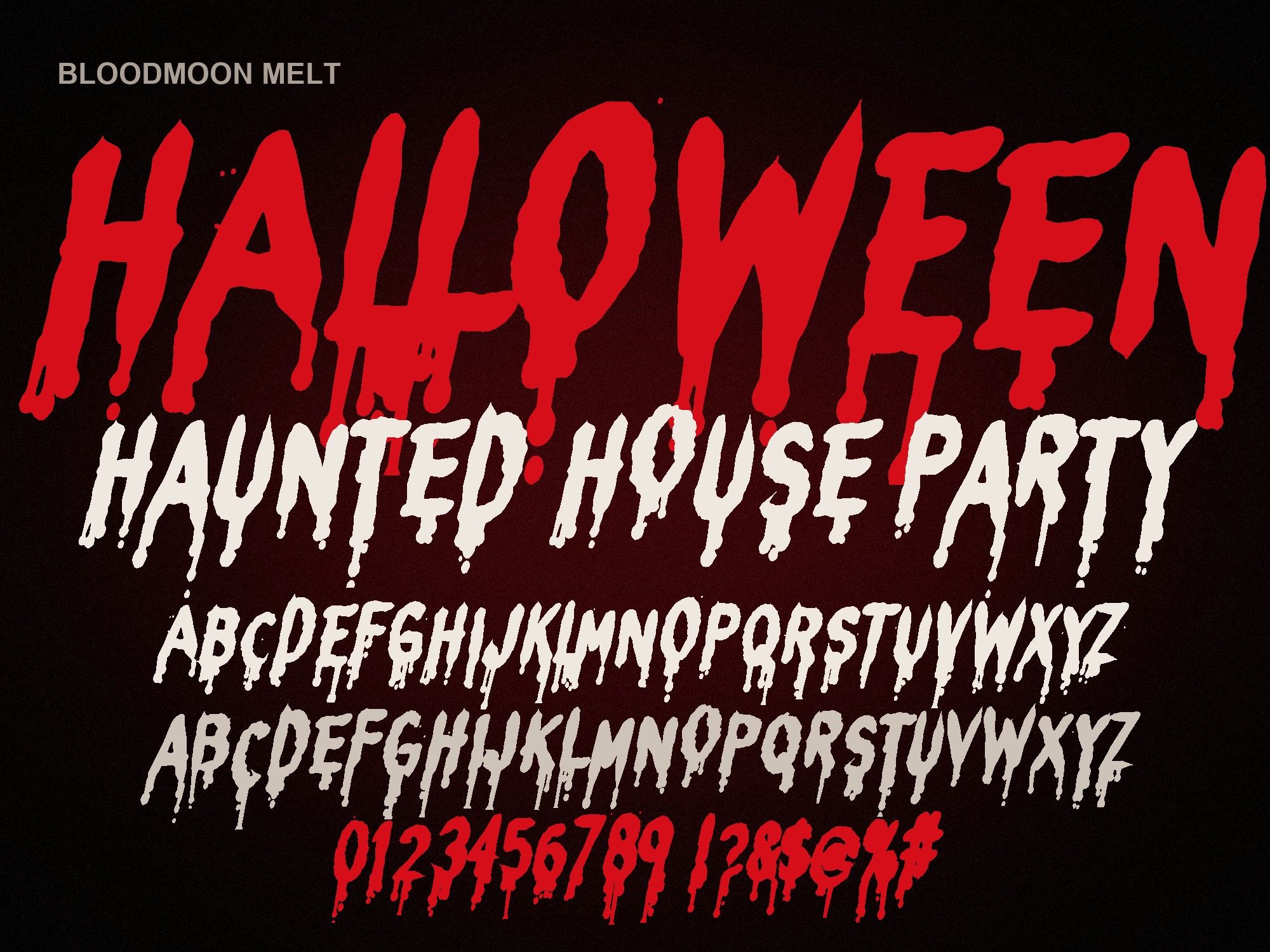
Melting blood font (Bloodmoon Melt)
Pair with: Inter or Roboto Condensed.
Melt is the most readable of the set, so it can carry longer titles. Pair it with something neutral that won't draw attention. Inter is plain and clear on screens. Roboto Condensed saves space when you have a lot of details to fit under the title.
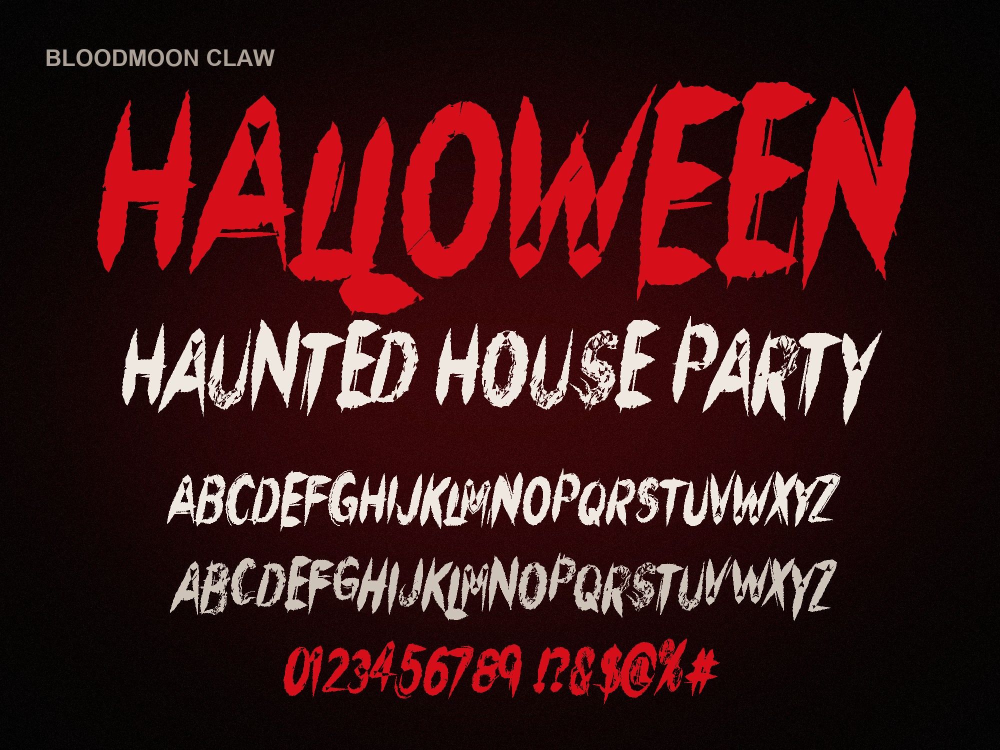
Claw scratch font (Bloodmoon Claw)
Pair with: Helvetica or Arial.
Claw is sharp and clean, which makes it a strong logo font. A classic neutral sans keeps a brand system simple. Use it for taglines, prices and labels. Both come preinstalled on most computers, so they also work in Word.
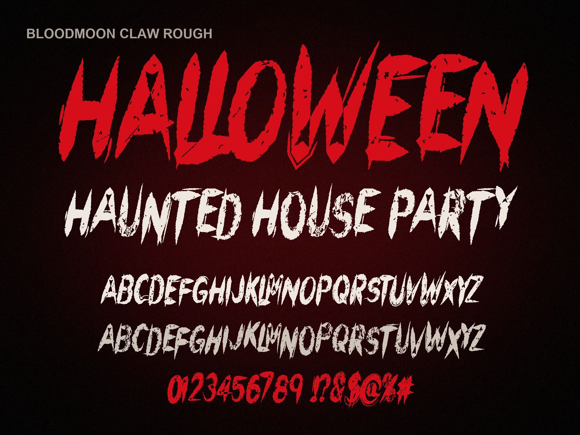
Distressed scratch font (Bloodmoon Claw Rough)
Pair with: Bebas Neue or Roboto Condensed.
Claw Rough has a worn, printed-a-hundred-times texture. A condensed, all-caps body font matches its gig-poster feel. Keep the body text crisp; adding texture to it as well turns the whole thing muddy.
Compare the display styles
Type your headline and see which style will carry it before you pick a partner font.
NIGHT OF TERROR
NIGHT OF TERROR
NIGHT OF TERROR
NIGHT OF TERROR
NIGHT OF TERROR
Preview shows capitals, numbers and basic punctuation. The full font adds a second drawing of every letter, accents and auto-alternates.
Four example layouts
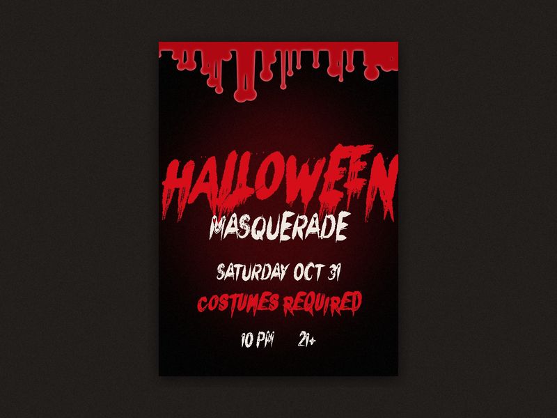
1. Halloween party flyer
- Headline: "HAUNTED HOUSE PARTY" in Melt, blood red, top third of the page.
- Details: date, time and address in Roboto Condensed, white, about a third of the headline size.
- Extra: "Costumes required" in Inter italic, smaller still.
- Layout: everything centered on a black background, with a drip border along the top.
More flyer ideas are on Halloween party flyer fonts.
2. Band or merch t-shirt
- Main word: band name in Claw Rough, white on a black shirt, across the chest.
- Sub line: tour name or year in Bebas Neue, red, letter-spaced wide.
- Layout: stacked and centered. Two lines only; shirts don't need a third.
3. YouTube thumbnail
- Title: two or three words in Melt, as large as fits, with a dark shadow.
- Tag: a short label like "PART 2" in Oswald inside a solid red box.
- Layout: left-aligned text on one side, face or scene on the other. Thumbnails are tiny, so skip the body text entirely if you can.
4. Haunted house sign
- Main sign: "ENTER IF YOU DARE" in Brush, deep red on weathered wood or black board.
- Small print: "Open Fri and Sat, 7 to 11 PM" in Helvetica, white.
- Tip: test it from across the yard. If a car driving past can't read it, go bigger.
Cutting the sign in vinyl? Follow how to install fonts on Cricut first.
A note on Word and Google Docs
Every body font above is easy to use in Microsoft Word, and our fonts work there once installed. See scary fonts for Microsoft Word. Google Docs is different: it can't load fonts you install yourself, so the horror font won't appear there.
Get the display fonts
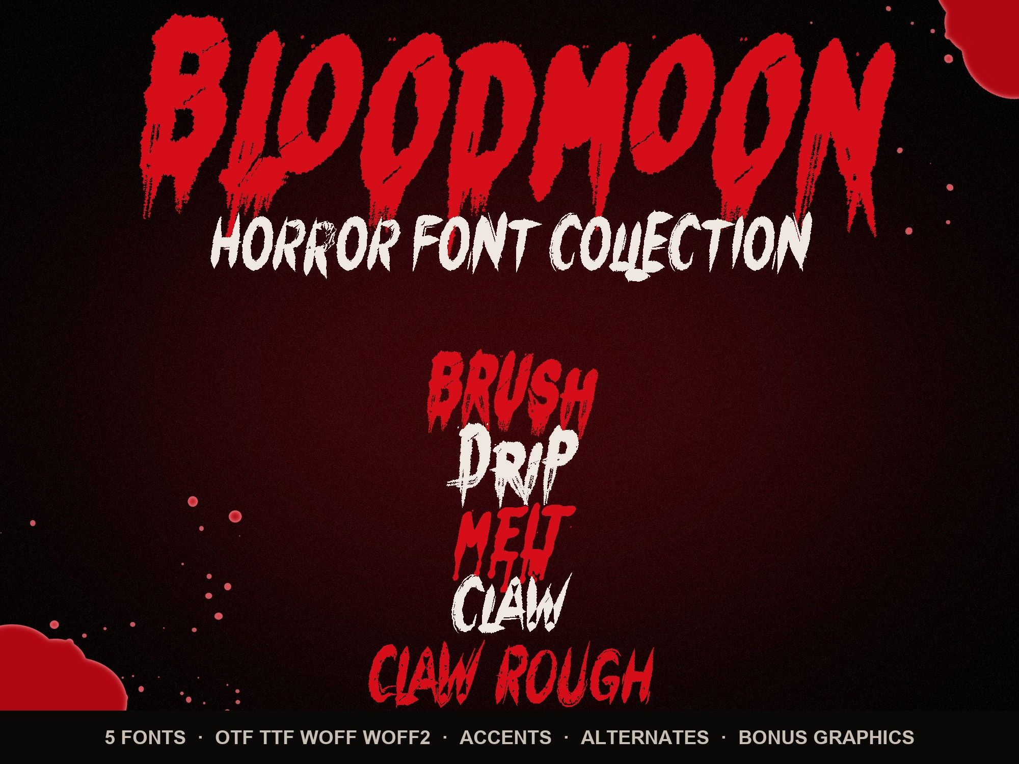
Each Bloodmoon font is $6. Need more than one look? The horror font bundle includes all five plus splatter and drip-border PNGs for $14. Still choosing? Read the best Halloween fonts comparison.
Instant download from Gumroad · OTF, TTF, WOFF, WOFF2 · Commercial license · Use LAUNCH30 for 30% off until Oct 31