Best Halloween Fonts
Picking a Halloween font is less about which one looks scariest and more about where it will end up. A shirt seen from across a parking lot needs a different letter than a logo printed one inch wide. This guide walks through five horror styles and the jobs each one does best.
Full disclosure: these are our fonts. We made the Bloodmoon collection, so this isn't a neutral roundup. What we can do is tell you honestly where each one works and where it struggles.
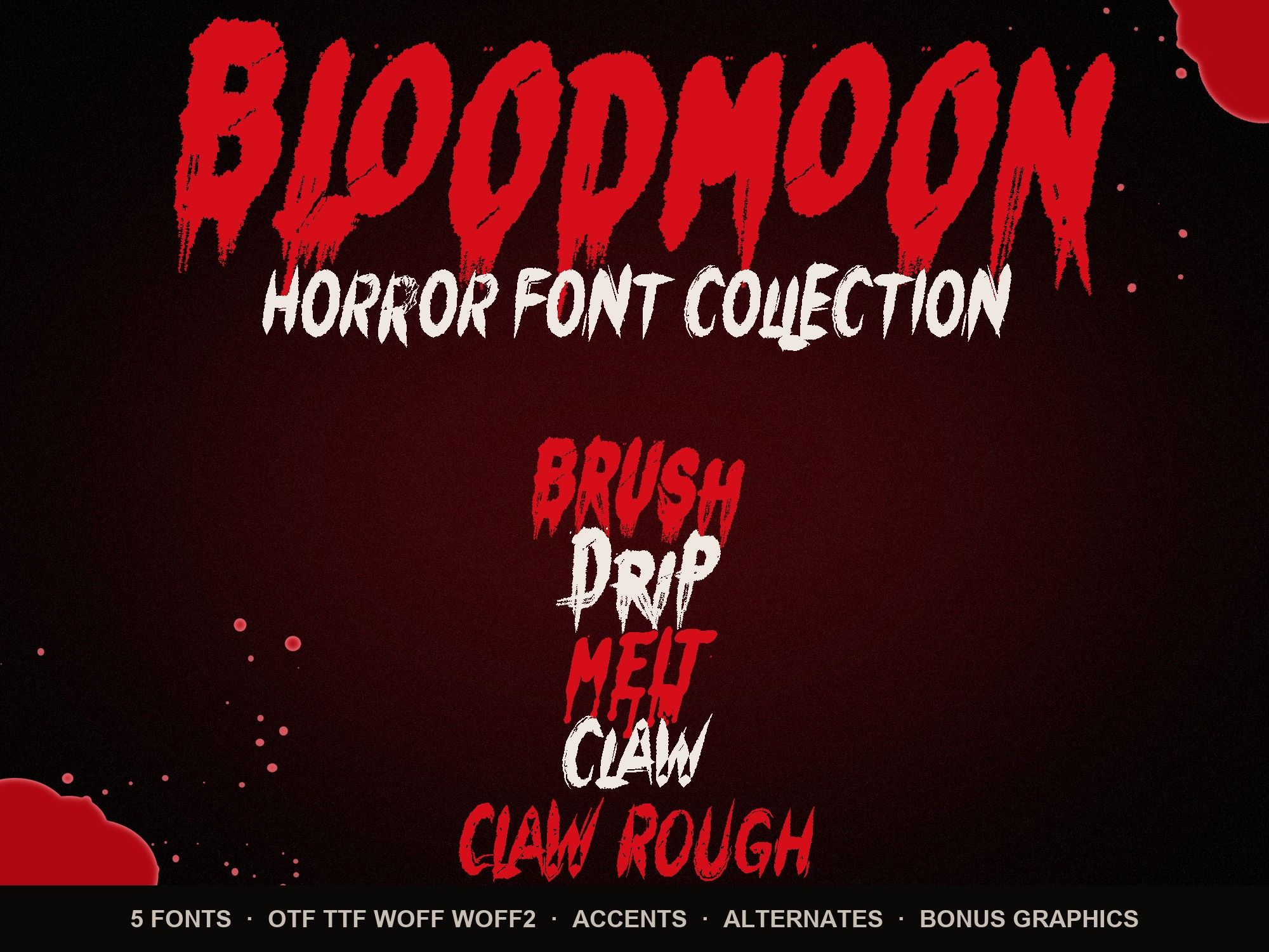
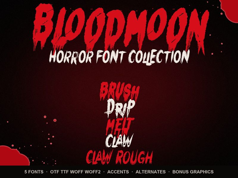
The five styles at a glance
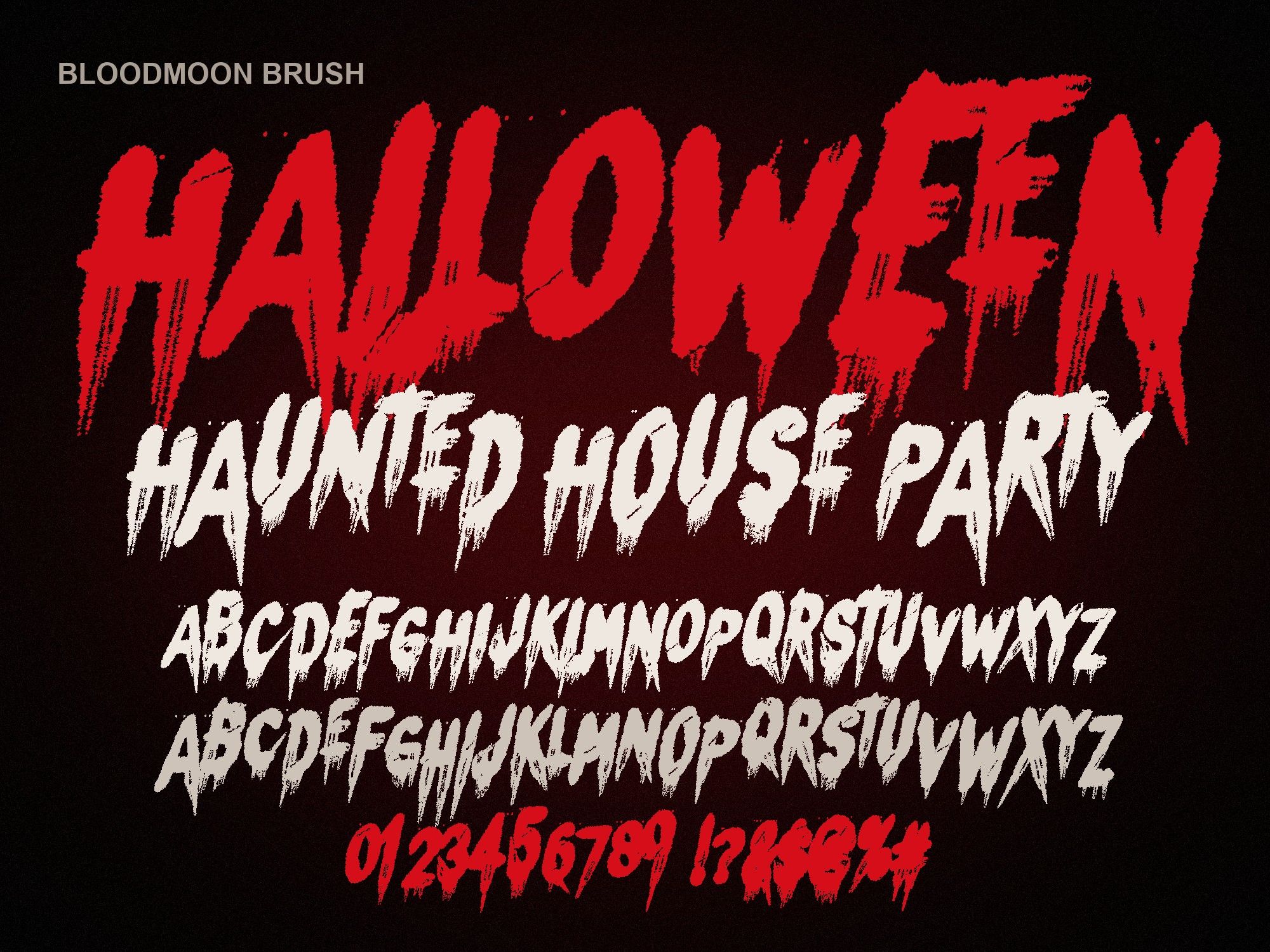
- Bloodmoon Brush: hand-painted brush capitals with blood running off every stroke. The classic painted horror look.
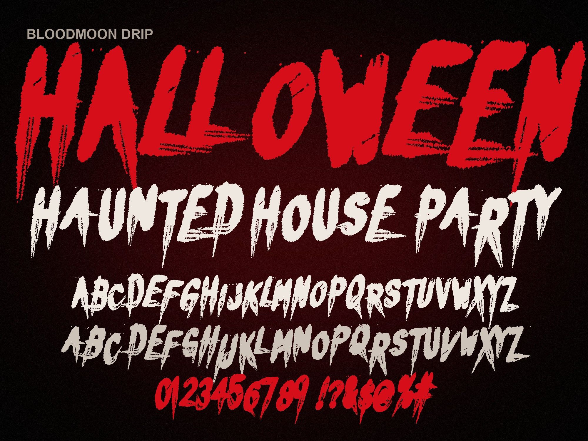
- Bloodmoon Drip: bouncy, uneven letters with long, sharp dripping tails. More playful, a little cartoonish.
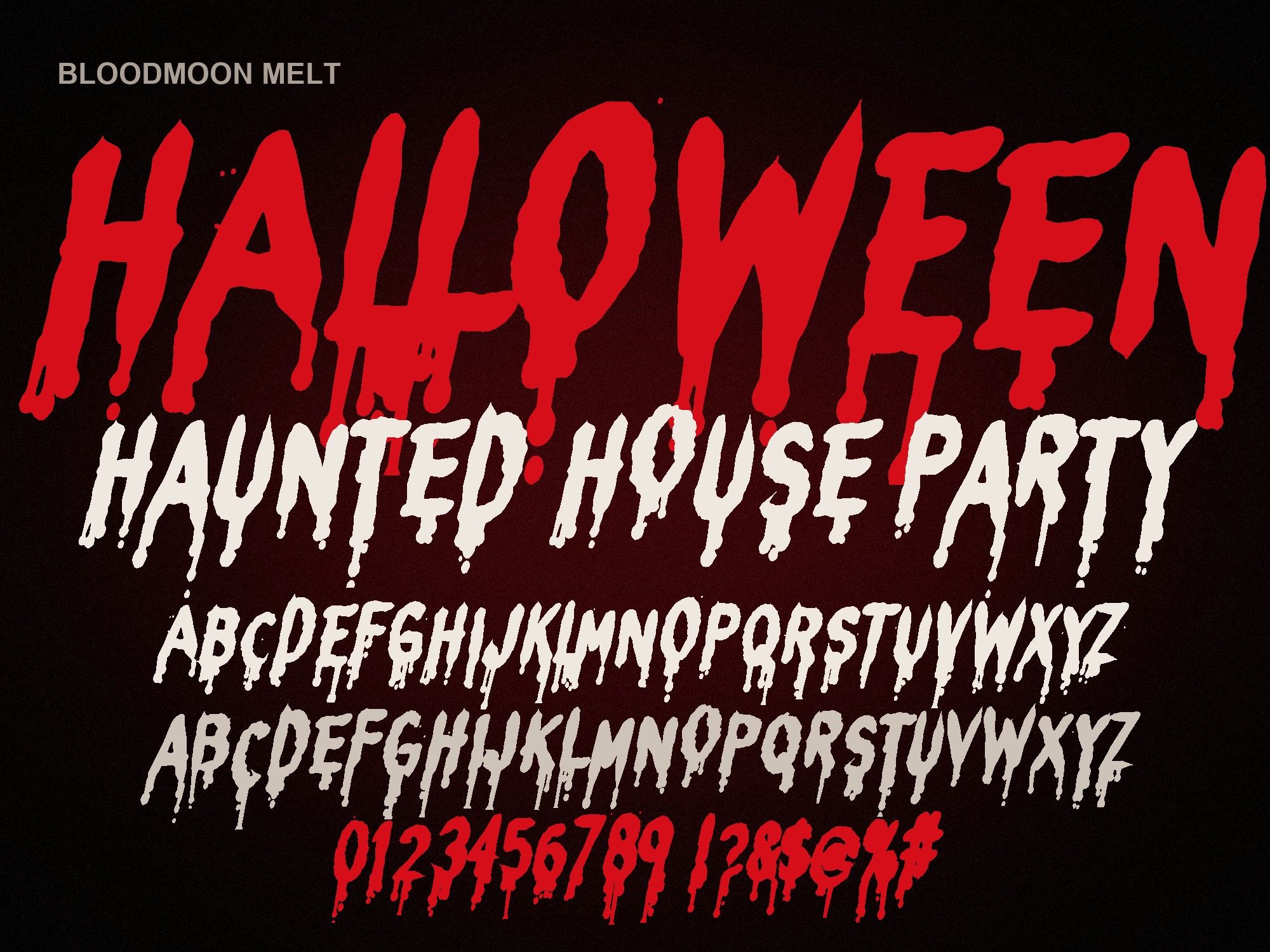
- Bloodmoon Melt: rounded letters that melt into drops and puddles at the base. The easiest of the five to read.
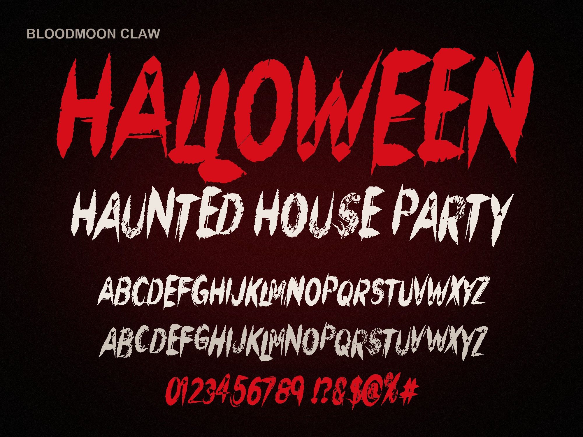
- Bloodmoon Claw: sharp, slashed capitals that look cut with a blade. No drips at all, just cuts.
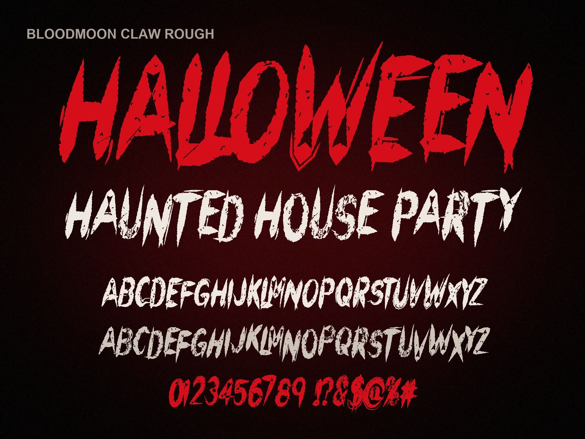
- Bloodmoon Claw Rough: the Claw letters scratched up and worn, like an old printed poster.
Comparison table
| Font | Readability | Drip length | Best size | Best for |
|---|---|---|---|---|
| Brush | Good at large sizes | Medium, uneven | Headlines, 24 pt and up | Posters, shirts, movie-night titles |
| Drip | Fair; the tails pull the eye | Long | Very large, one or two words | Kids' parties, playful invites, stickers |
| Melt | Best of the five | Short; pools at the base | Headlines and subheads | Flyers with longer titles, video titles |
| Claw | High; clean shapes | None | Works small and large | Logos, labels, vinyl cuts |
| Claw Rough | Good at large sizes | None; worn texture | Large, where the texture shows | Band merch, gritty posters, thumbnails |
Try all five with your own words
Type the exact words you plan to use. A font that looks great on "BOO" can fall apart on "SATURDAY OCTOBER 31".
HAUNTED HOUSE
HAUNTED HOUSE
HAUNTED HOUSE
HAUNTED HOUSE
HAUNTED HOUSE
Preview shows capitals, numbers and basic punctuation. The full font adds a second drawing of every letter, accents and auto-alternates.
Which font for which project
T-shirts and hoodies
Shirts are read from a few feet away, often while someone is moving. Go with Brush for a classic horror tee or Claw Rough if you want a worn, band-merch feel. Keep it to one to three words across the chest. White or red on a black shirt gives the strongest contrast.
Party flyers and posters
A flyer has a headline plus a pile of details: date, time, address, dress code. Use Melt or Brush for the headline only, and set everything else in a plain sans-serif. Our Halloween party flyer fonts page shows a full layout, and the horror font pairings guide covers which body fonts sit well underneath.
Logos
Logos get shrunk down to tiny sizes on receipts, profile pictures and labels. Drips fill in when they get small, so pick Claw. Its sharp cuts stay crisp. Pull letter spacing in a touch (-10 to -20) so the word holds together as one shape.
Video titles and thumbnails
Thumbnails are viewed at the size of a postage stamp. Melt reads fastest, so it wins for YouTube and short-video titles. Claw Rough also works if the title is short and you put it on a dark, simple background.
Cricut and vinyl cuts
Cutting machines struggle with hair-thin details. Claw is the easiest to cut and weed. Brush and Melt cut well if you size them up so the drips aren't paper-thin. The step-by-step setup is in how to install fonts on Cricut, and project ideas live on Halloween fonts for Cricut.
Kids' events and school parties
For a classroom party or a trunk-or-treat sign, you want spooky, not gory. Drip has a bouncy, almost cartoon shape that feels fun rather than grim. Print it in orange, purple or lime green instead of blood red and it turns friendly fast.
General tips for choosing a Halloween font
- Test at real distance. Print a sign at full size, tape it to a wall and step back ten feet. If you squint to read it, the font is too busy or too small.
- One scary font per design. Two horror fonts fight each other. Let one be loud and keep the rest plain.
- Contrast beats color. Dark red on black looks moody on screen but disappears in print. Add a thin light outline or put the text on a lighter panel.
- Pick a deep red. Blood reads as dark and slightly brown, around #8A0303 to #B3121F. Bright pure red looks like a clearance sale.
- Leave room for drips. Dripping letters hang below the line. Add extra line spacing or the drips run into the next row.
- Mix the two letter drawings. Each font has a second drawing of every capital on the lowercase keys. Typing "HaUNTeD" mixes them so repeats look hand-made.
What about apps?
All five install like any normal font on Mac or Windows and then show up in Cricut Design Space, Word, Photoshop and Illustrator. Canva needs a Pro or Teams account to upload fonts; see Halloween fonts for Canva. Procreate can import the file straight from the Files app, covered on horror fonts for Procreate. Google Docs is the one place they won't work, because it can't load fonts you install yourself.
Not ready to buy? Make a quick image in the free dripping blood text generator and see how your words look first.
Get the whole set
Each font is $6. The horror font bundle has all five plus 14 bonus transparent PNGs (splatters, drip borders and word art) for $14, which is cheaper than buying three on their own.
Instant download from Gumroad · OTF, TTF, WOFF, WOFF2 · Commercial license · Use LAUNCH30 for 30% off until Oct 31